Case Study
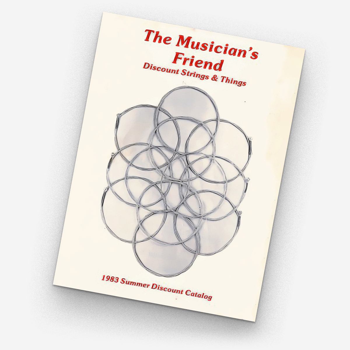
Operating out of a suburban California garage in 1983, Musician’s Friend produced it’s first catalog selling guitar strings and a handful of other accessories. As one of the earliest catalog marketers of music gear and the first to focus on outfitting rock bands, Musician’s Friends experienced rapid growth.
Over the past few years the company has shifted it’s focus to e-commerce and moved to producing only a few print pieces a year. This change in the business model and strategy opened the door to a rebrand.
Creative Challenge
Clarify the brand narrative and reposition the brand to stand apart from other MI retailers such as Guitar Center and Sweetwater. Use the new brand narrative to establish new, thorough, and highly detailed style guidelines to aid designers, writers, photographers, marketers and all others who touch the brand.

Rebrand
Upon initiating the rebrand we looked at the legacy of what made Musician’s Friend great. As the name suggests, they were friendly, approachable, knowledgeable and ready to help out all musicians despite their experience level. Musician’s Friend had begun to lose their identity and it was time to turn it back around. Using the new brand narrative and attributes as a guide, we audited every corner of the business. From the brand voice to CRM and email strategies.
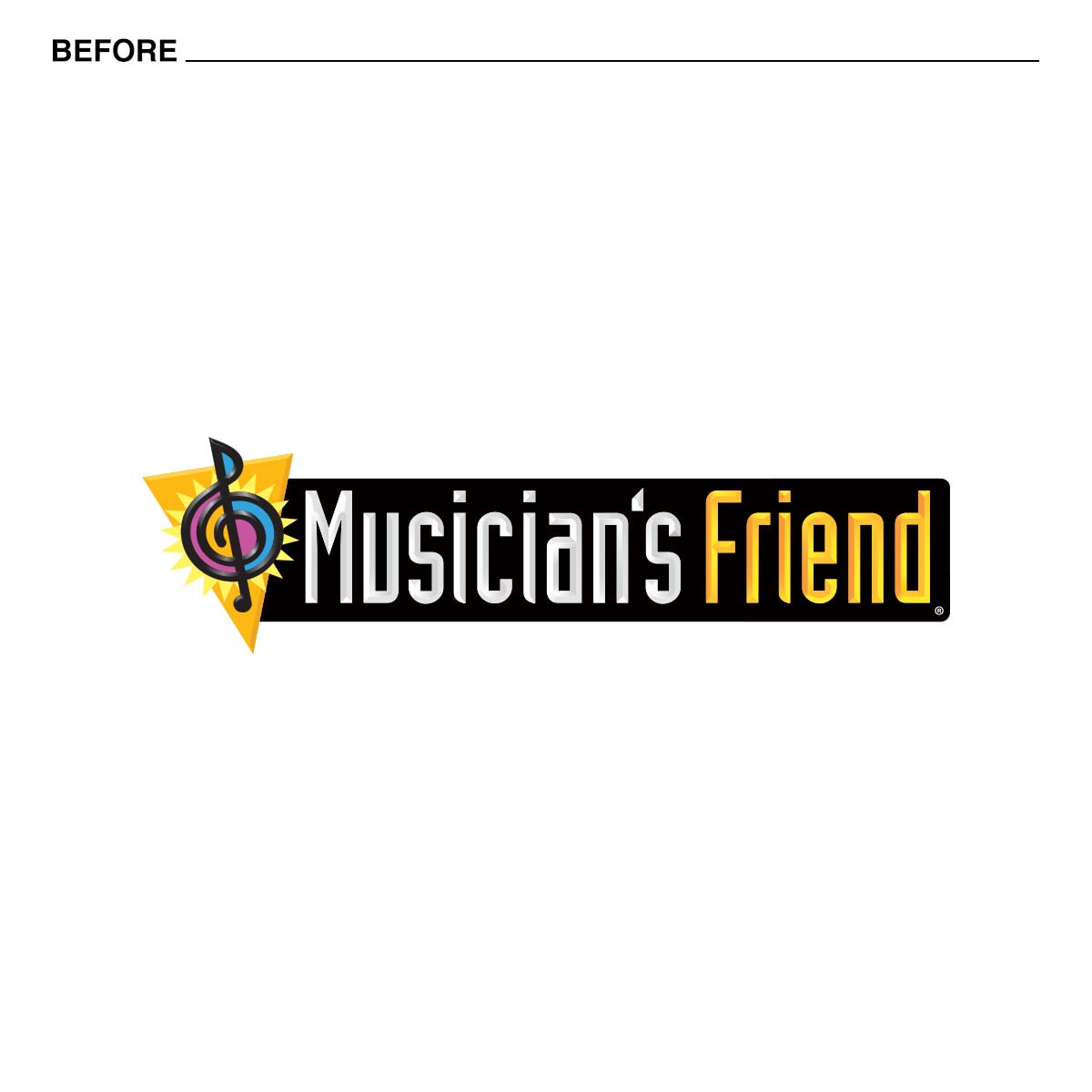
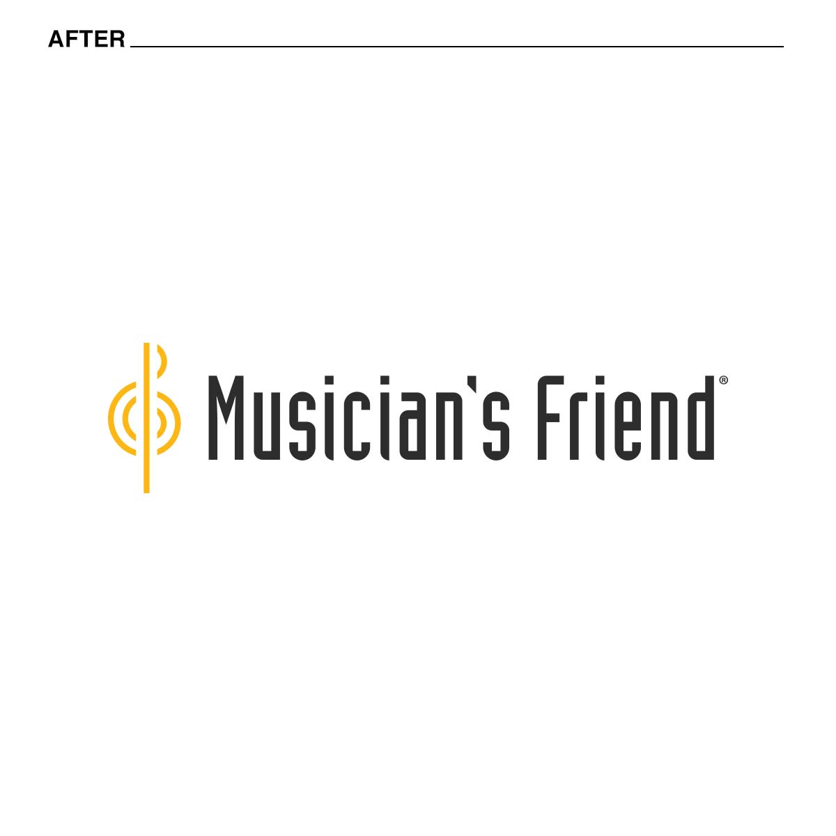
Our first initiative was to update the Musician’s Friend logo. The long standing 4 color logo had an honorable run but as the business shifted to an ecomm first approach it was imperative to update to a modern, clean logo that could sustain quality and legibility across multiple devices and mediums.
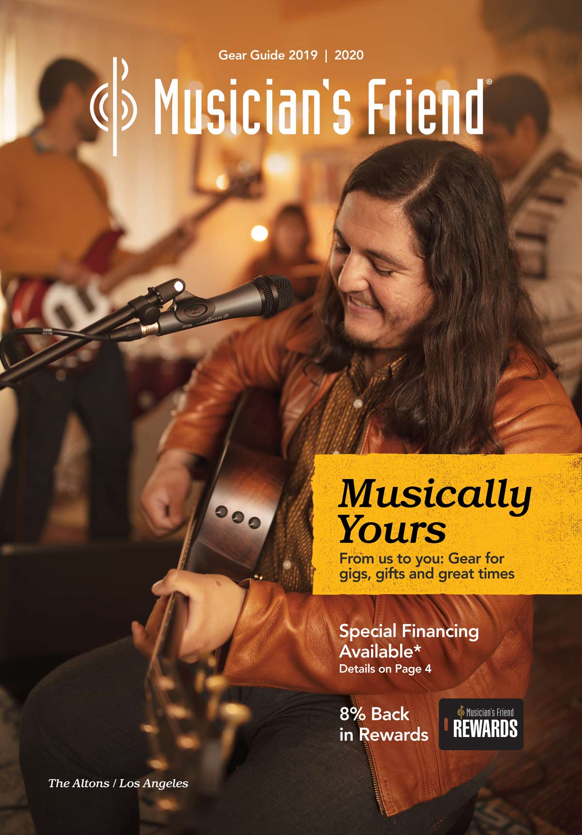

Musician’s Friend had confined itself to a single font, Gotham, for several years. Although a fantastic font by most accounts it would not have the ability to scale in the digital space as it is not currently available in a web format. In addition Gotham was also a bit too cold and techy for the brand.
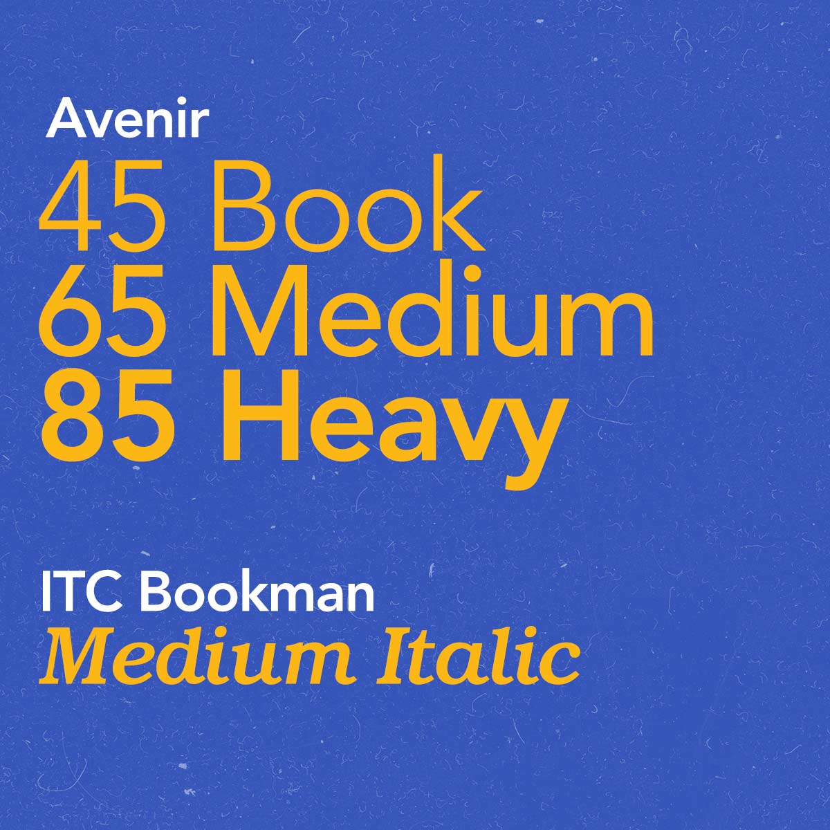
Through exploration and user studies we landed on 2 new font families—Avenir and ITC Bookman. Specifically we’ve designated the following typefaces: Avenir 45, 65 & 85 and ITC Bookman Medium Italic. All of which have clear direction in the guidelines for appropriate use.
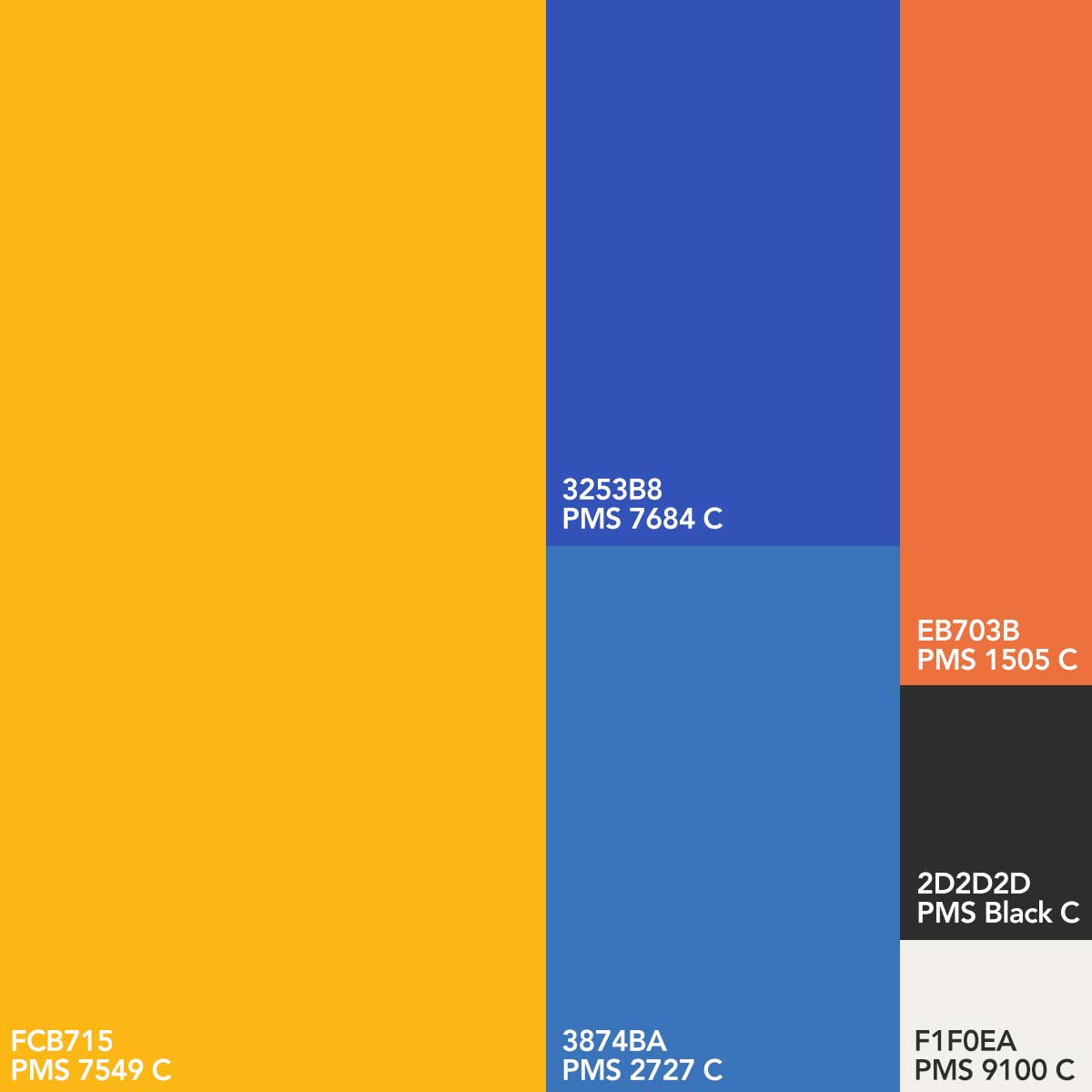
A new color pallete has also been established to lift the brand into the new century; vibrant swatches that support the brand initiative and elevate the creative.
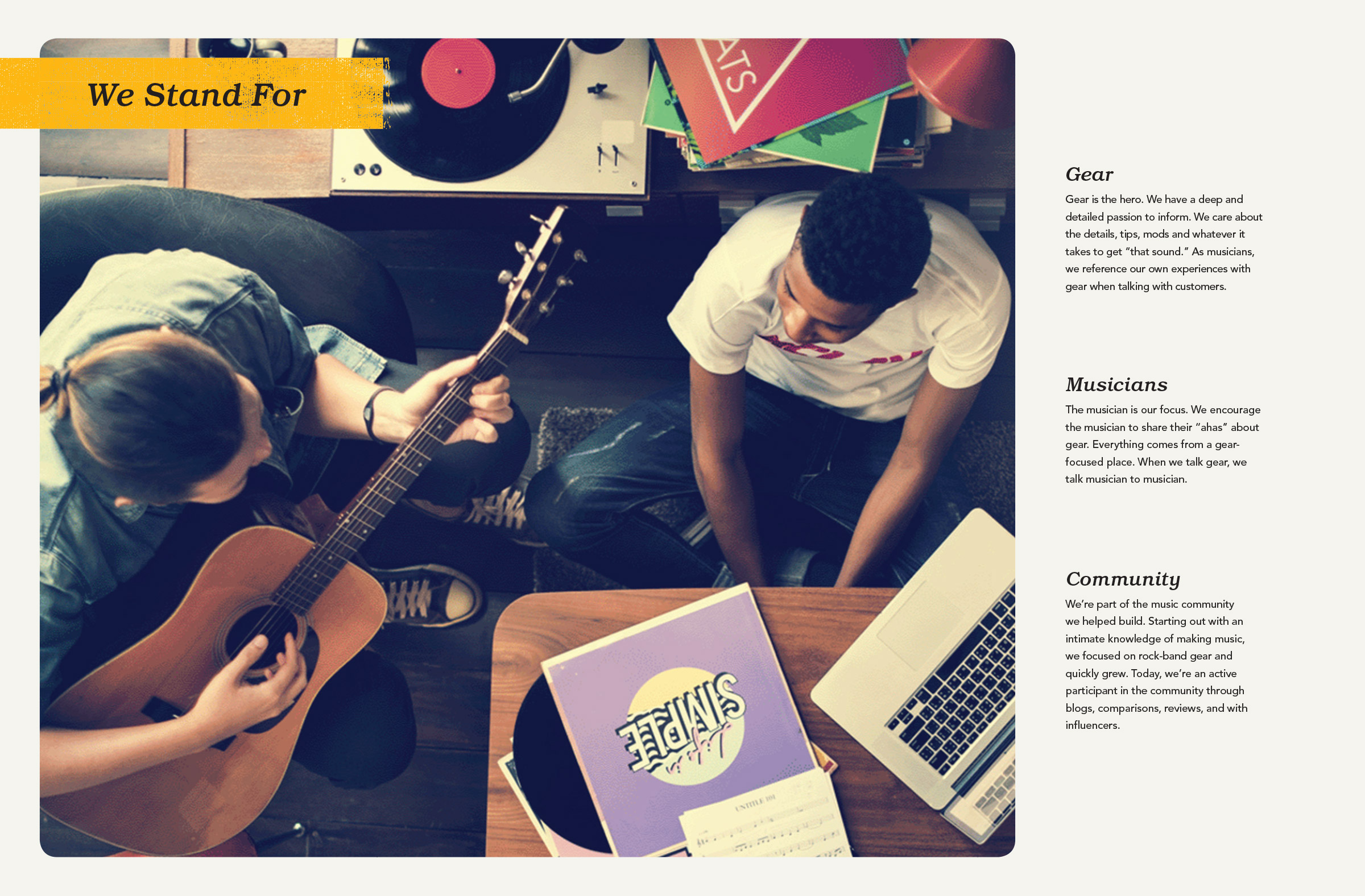
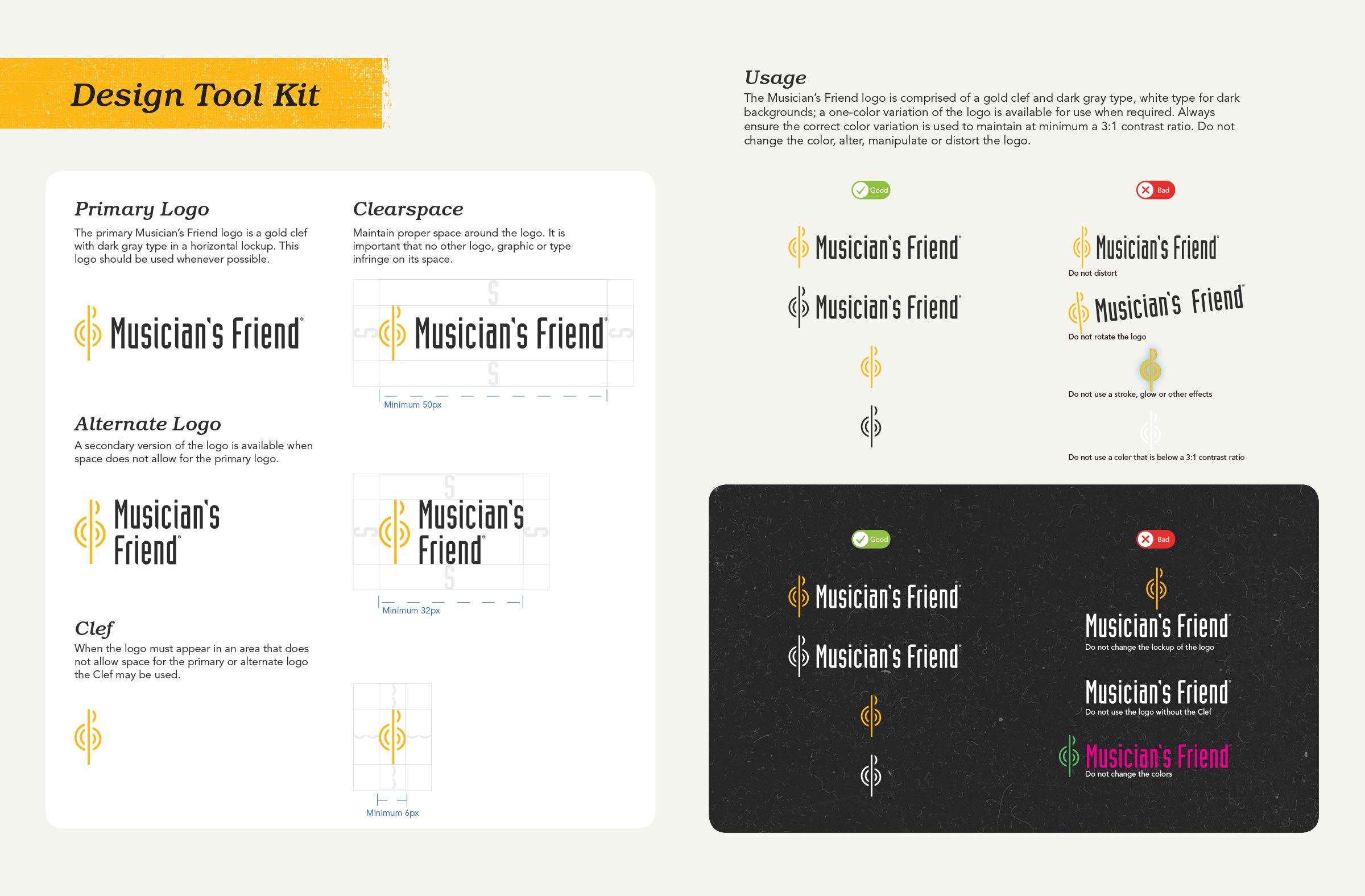
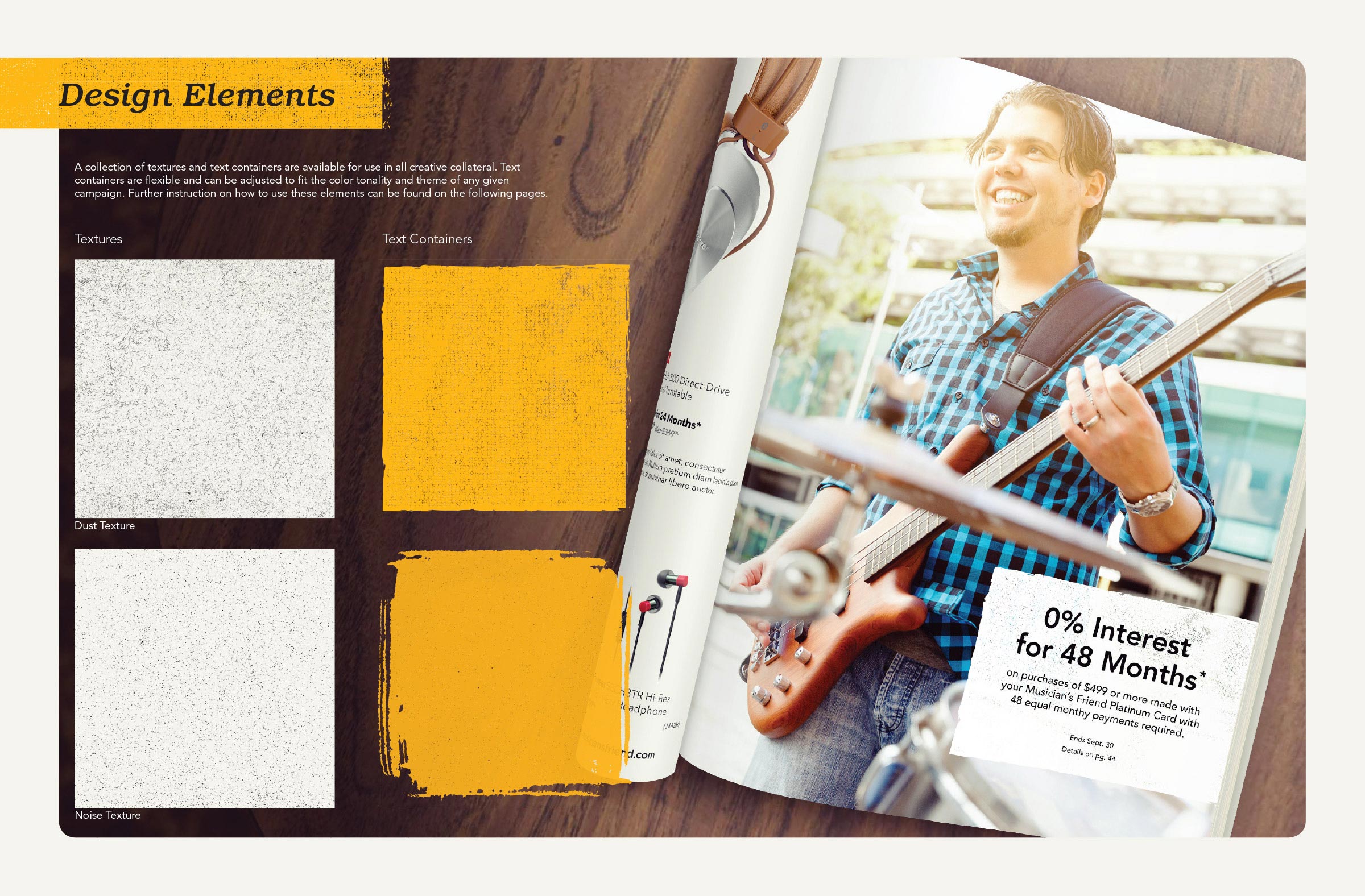
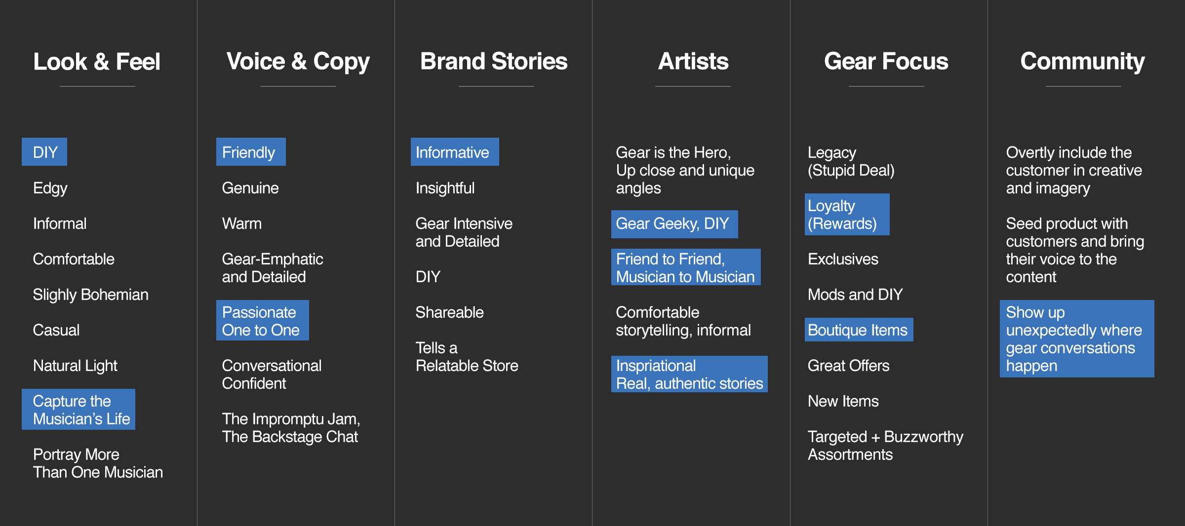
A challenge that plagued the brand was the lack of cohesive visual storytelling. As no formal rules had been established, many campaigns had creative that lacked any visual branding and/or brand voice. Included in the new brand guidelines are copy directions for the brand voice—how writers should craft advertising copy, articles, interviews, social posts, etc. and Recipe Cards for designers to use as an aid to develop advertisements that are cohesive across all campaigns and marketing efforts.
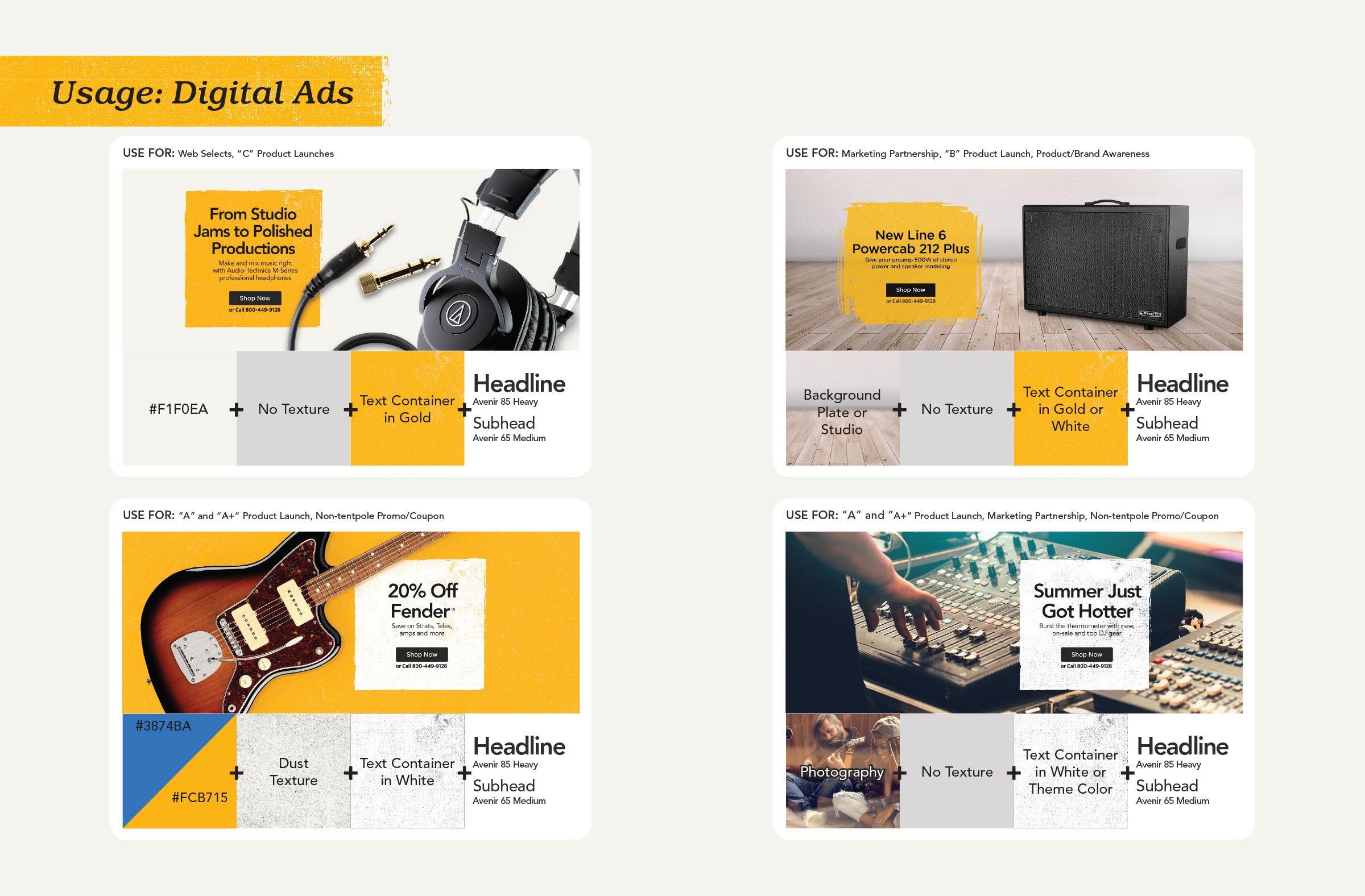
Translating to E-Comm
Lorem ipsum dolor sit amet, consectetur adipiscing elit. Aenean in sapien in massa pellentesque tincidunt sit amet vel augue. In nulla justo, condimentum vitae velit a, dapibus tincidunt sem. Curabitur posuere nisl a justo porta feugiat. Praesent sit amet lectus nec augue facilisis euismod et eget ex.
Results
Since the adoption of the new brand narrative, attributes and guidelines the organization is now aligned on who Musician’s Friend is. Copywriters are writing meaningful and effective advertising copy that is informative, warm and friendly. Designers are creating campaign art that is cohesive, exceeds stakeholder expectations and is on brand. Photographers, marketers, merchandisers, etc. are now more informed on the brand goals and are able to support business initiatives more efficiently. UX Designers and Web Developers now have the tools they need to build an online experience that represents the brand from homepage to checkout and everything in between.
Stylescape for Musician’s Friend rebrand


