Case Study

In 1941, just before the beginning of World War II, Fresno County Employees Credit Union was founded. In the 1990s the credit union was converted to a federal charter and grew substantially, but the name was limiting its growth potential and it no longer was able to convey what the financial institution had become to its members and community. In 2017 the credit union changed its name to Noble. “Noble” was the only word that could accurately describe how they treat their members with respect and kindness.
In 2020, Noble decided it was time to rebrand as they saw an opportunity to separate themselves further from their competition and a path forward to accelerate their growth trajectory.
Creative Challenge
Defining key value propositions, repositioning the financial institution, changing the market perception of credit unions, and communicating the unique perks that make Noble different were key to a successful rebrand.
Through the process of rebranding Noble, it was determined that we need to “Just Say it.” There’s no room for hiding behind ambiguous headlines or overly-conceptualized campaigns. Noble has perks, great perks, and perks that even the staff had no idea they offered. If the employees of the credit union didn’t know, how would members know?
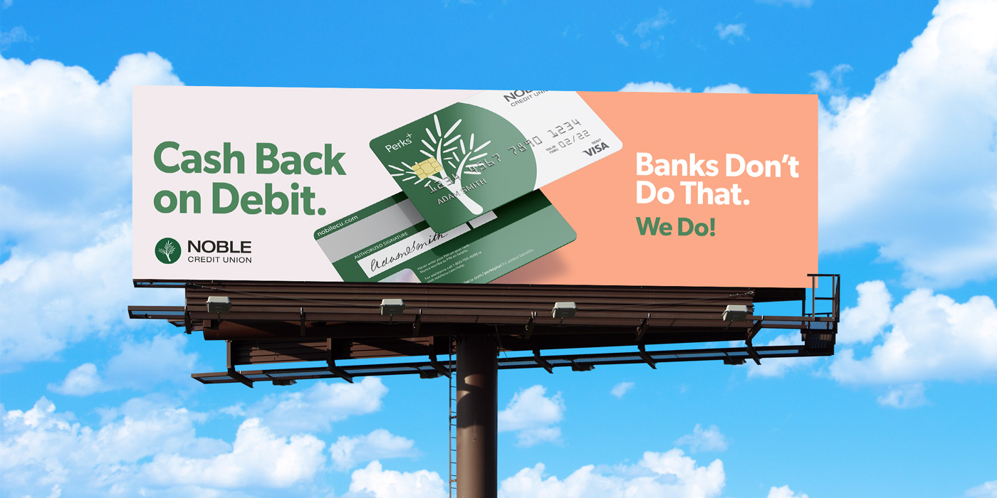
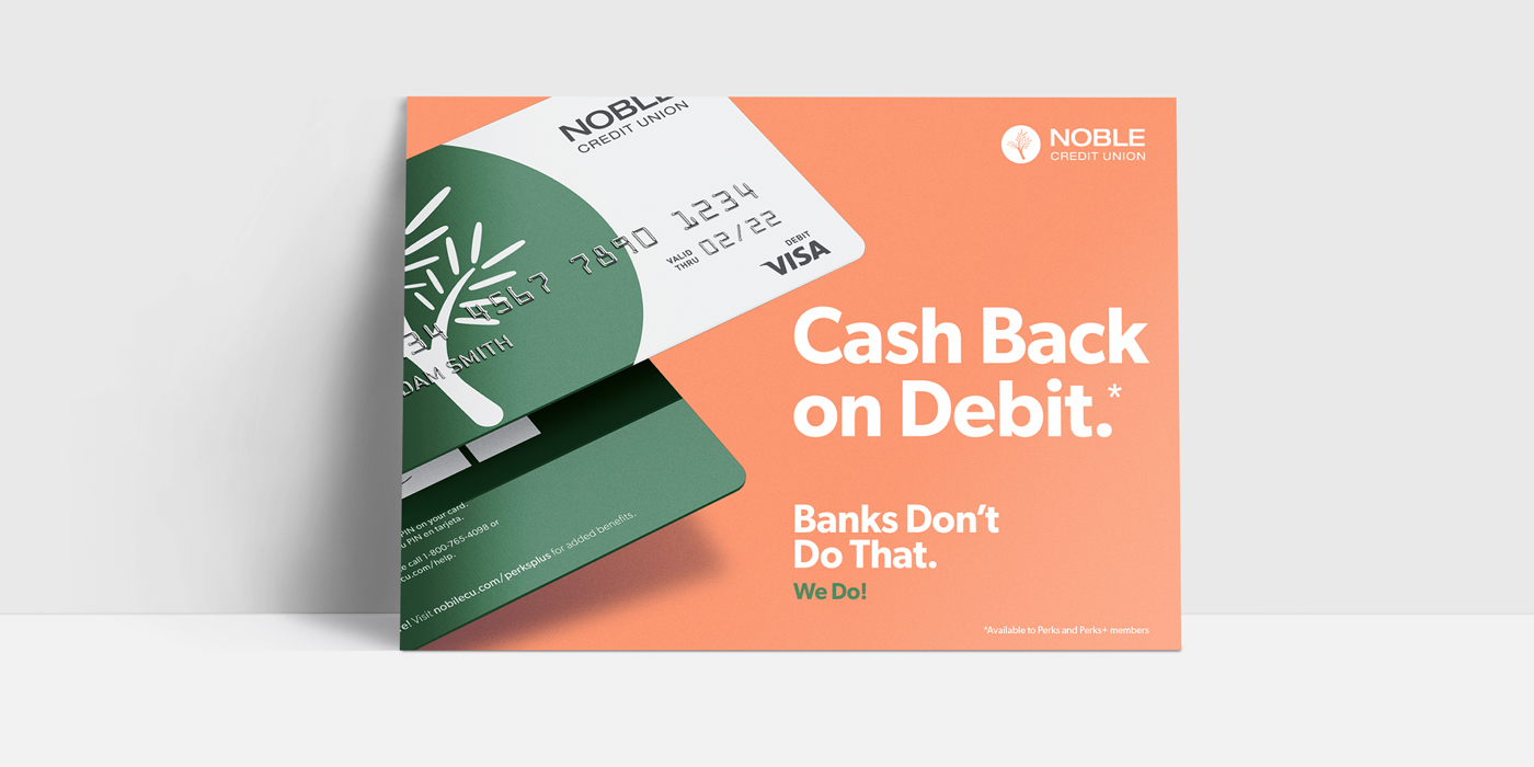
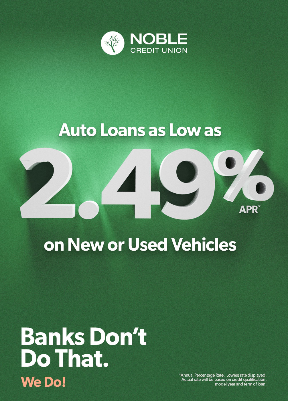
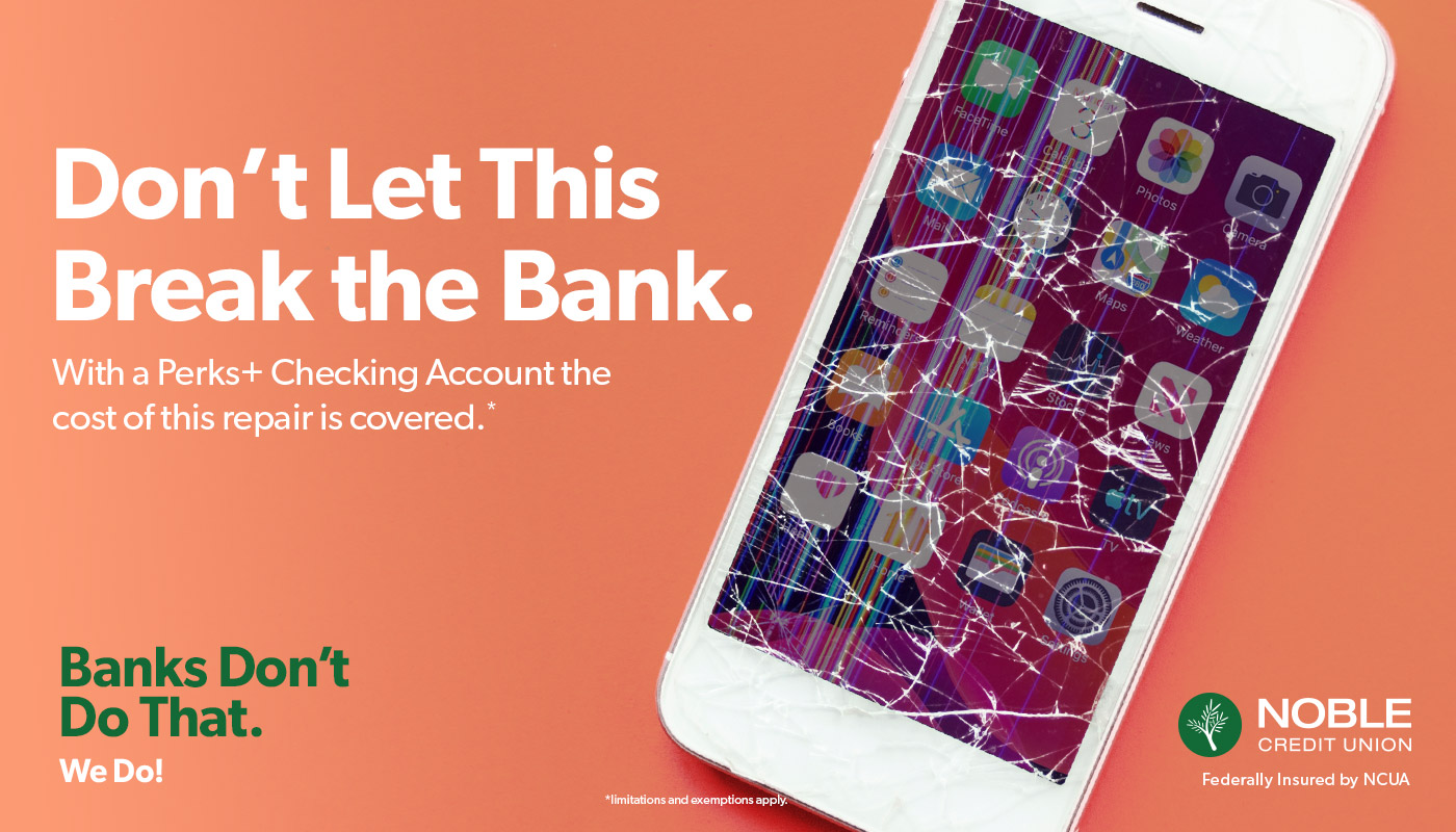
It became clear early on, Noble was not going to act like a bank because Noble is not like traditional banks. They genuinely care about each and every member and actively seek to provide the best service and products for their members. They have unheard-of benefits: Cash Back on Debit, Roadside Assistance, Cell Phone Protection Plans, and a Rewards Program that actually is worth signing up for. What they were offering, banks didn’t. It was obvious, we needed to shout it out for all to hear, “Banks Don’t Do That. We Do!”
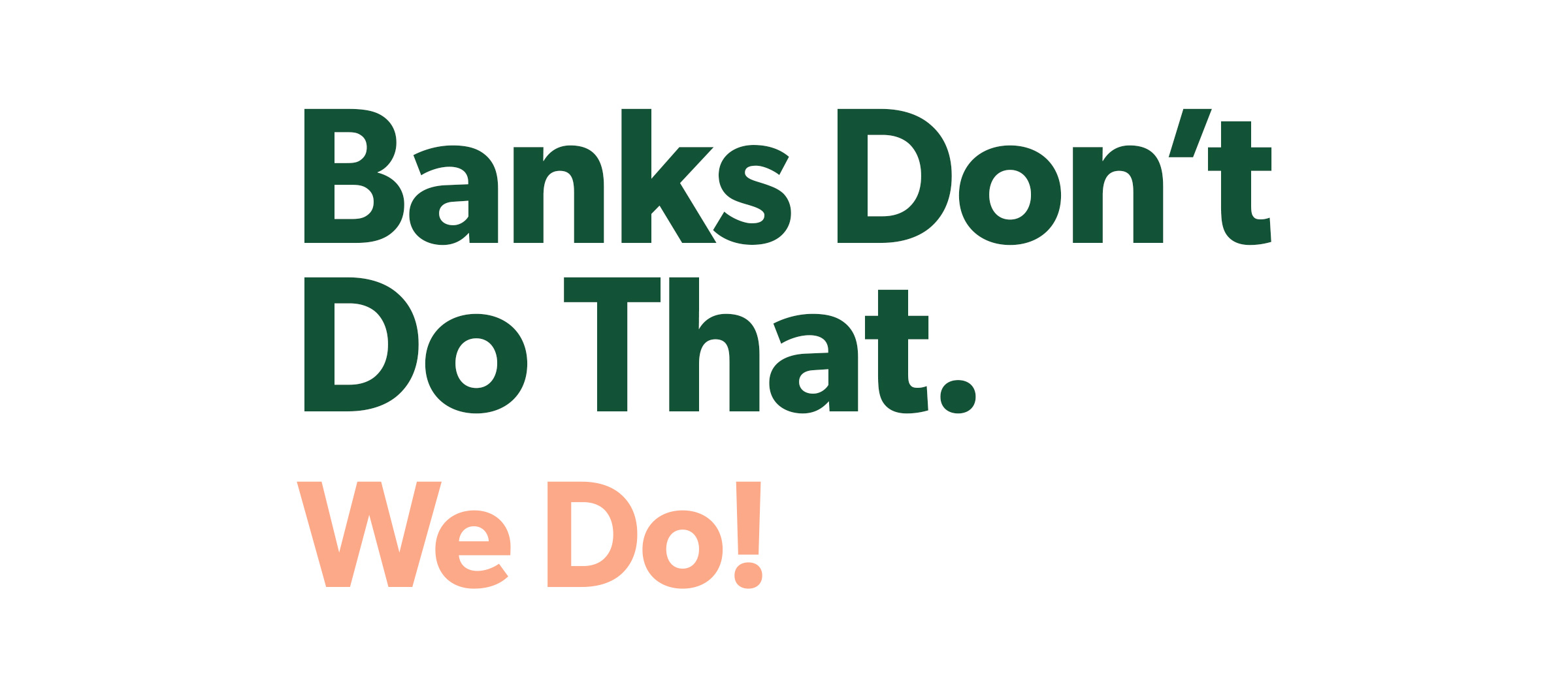
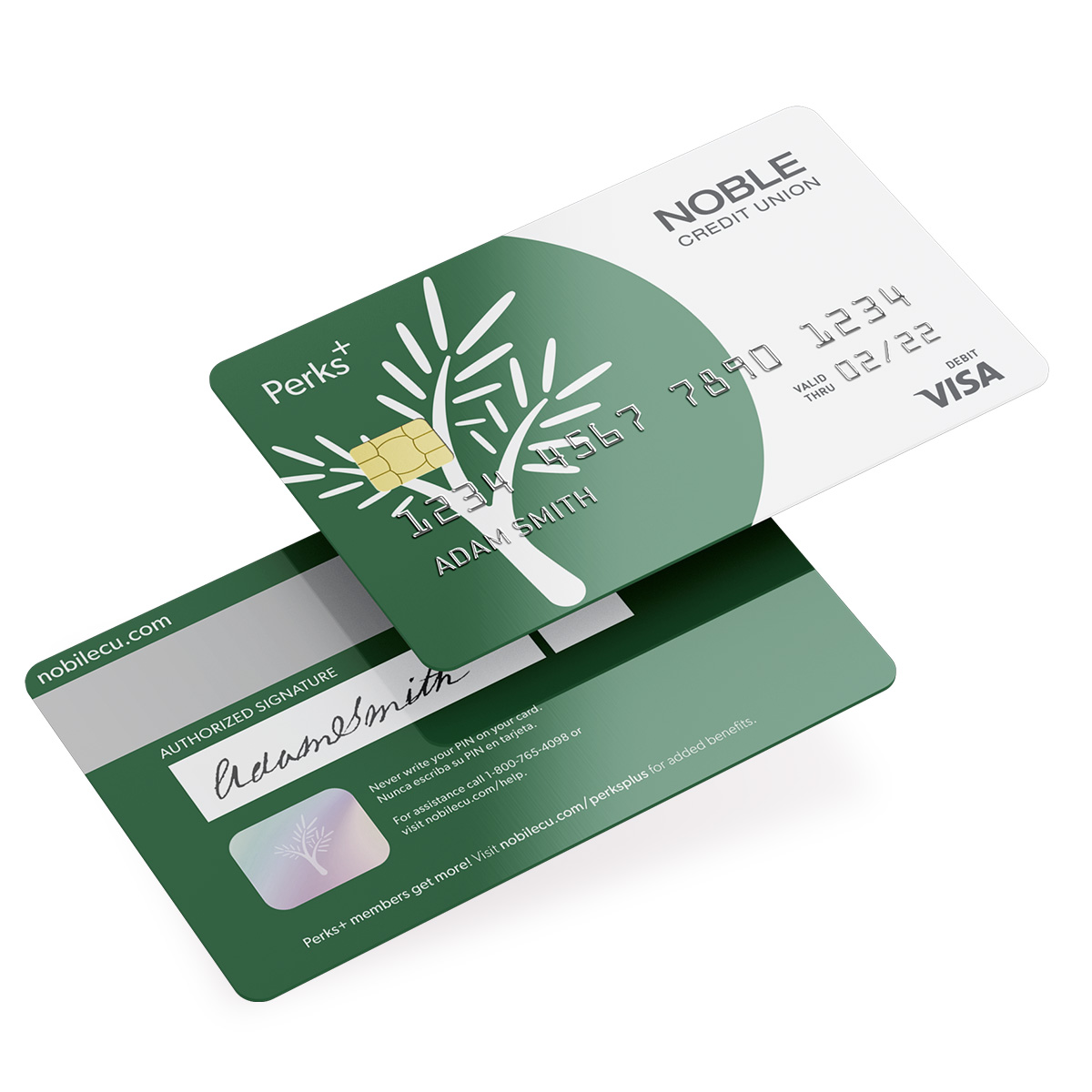
A bold and uninhibited message needed to be paired with a visual voice that was unconventional. The Noble logo and green/black colors were left untouched, however, there was room to expand and create a design system that could allow the brand to grow into modern times and push the boundaries of what a financial institution should look like.
In general, credit unions feel and sound like the place your grandparents do their banking. They’re dated, boring, and out of touch. This was the perception we wanted to change. Noble should appeal to a new and younger generation all while taking care not to alienate existing members.
The new branding includes a color scheme that’s unlike any seen in the finance industry, yet it feels appropriate and allows Noble to have complete ownership of this look. The voice and tone are warm, welcoming, and confident, and complimented with typography that speaks volumes.
There’s no mistaking this branding as anyone other Noble.

Results
The rebrand has been well received by the client, its members, and the community. Upon launching the rebrand and the “Banks Don’t Do That. We Do!” campaign, new member sign-ups are through the roof. For the month of May 2021 alone, digital ads produced over 3.1M impressions, SEM had a CTR of 24.41% (1,200% over industry average), and performance on Facebook performed extremely well with over 300K impressions and over 2K clicks.
The rebrand and launch strategy was such a success that the client requested to pause the digital campaign for a short period of time as they were unable to keep up with the demand.
Stylescape for Noble Credit Union rebrand


